A market screener, heatmap and comparison table can make a large set of crypto assets easier to explore. Each view answers a different question: a screener narrows a list using selected fields, a heatmap summarizes relative size and recent movement, and a comparison table places a few assets side by side. Used together, they can help organize research without turning a single indicator into a conclusion.
CryptoWave’s market screener, heatmap and asset comparison are descriptive tools built around tracked market data. The values can change, may be delayed and may reflect provider-specific definitions. Start with a question, inspect how each view defines its fields and confirm important information with primary sources.
Begin with a question, not a filter
Before opening the screener, decide what you are trying to understand. You may want to see which large assets have unusual daily volume, find assets with positive movement over a chosen period, or check how a DeFi-marked asset compares with peers. A specific question helps you choose relevant fields and avoid scrolling through results without a purpose.
Write down your inclusion rule before looking at the output. For example, sort by market capitalization, inspect the larger assets in the list and then review volume, price movement and source information. CryptoWave’s current screener supports searching by name or symbol, sorting by rank, market capitalization, 24-hour change, 7-day change or reported volume, filtering gainers or decliners, and limiting results to assets marked as DeFi. It does not provide every possible filter, and a listed category is not a full classification of a project.
Use the screener to form a candidate list
Search for an asset you already know, or sort the tracked list by a field related to your question. Sorting by rank or market capitalization can orient you among larger listed assets. Sorting by volume may surface assets with more reported trading activity in the available data. Sorting by recent percentage change can help identify movement for further review, but it does not explain the cause or establish a trend.
The gainers and decliners filters are simple descriptions of the selected daily field. The positive-change filter highlights assets above its threshold; it does not account for risk, price history, execution costs or whether the movement is supported by activity across independent venues. Use the search field to inspect a candidate and open its asset page before adding it to a research list.
Reported volume needs context. Different providers can use different venue coverage, trading-pair treatment, time windows and outlier filtering. A high number does not automatically mean an asset can be traded at that value with little price impact. Check the exchanges and pairs available to you, and consider how much liquidity exists near the quoted price.
Read the heatmap as a compressed overview
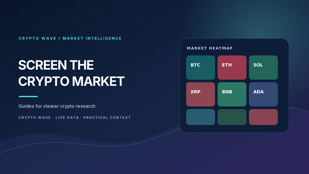
On the CryptoWave heatmap, tile size represents a market-cap size grouping and color represents the asset’s 24-hour percentage move. Larger tiles draw the eye to assets with more market value in the mapped set. Stronger green or red shades show larger positive or negative daily movement. A neutral color indicates a smaller change relative to the scale in the legend.
The map is a quick visual summary, not an exact allocation chart or complete market view. Tile sizes are compressed into a grid so that assets remain visible; they should not be read as precise portfolio weights. The heatmap covers a subset of tracked assets, so a pattern in the map does not prove that the entire market is moving the same way. Confirm the mapped set and time window shown on the page.
Look for the broad pattern before focusing on an individual tile. If many large tiles share a direction, that can suggest broad participation among the assets shown. If only a few smaller tiles stand out, the move may be concentrated. Neither pattern identifies a cause by itself. Check news, market volume and relevant project information before interpreting the change.
Compare only a few candidates at a time
Once you have two or three candidates, use CryptoWave’s comparison page to review price, market capitalization, 24-hour volume, 24-hour and 7-day changes, and reported circulating or maximum supply fields. Comparison works best when the assets are related enough for the same questions to make sense. Comparing unrelated projects can still show field differences, but it does not make them equivalent.
Price alone is especially easy to misread. A low unit price does not mean an asset is inexpensive relative to its supply or network value. Market capitalization is commonly derived from price and a circulating-supply estimate, but the definition of circulating supply can vary. Maximum supply may be unknown, unlimited or not reported. A missing field should not be treated as zero, and a reported number should be checked against the project’s documentation when it matters.
Volume and market capitalization describe different things. Market capitalization is a snapshot of unit price multiplied by a supply measure; volume describes reported trading over a period. Neither figure tells you how much value can be executed at a particular price. Use them as screening context, then look for venue-level order depth, spread and route information if you are evaluating a transaction.
Check the data before drawing a conclusion
Market-data services combine information from sources that can differ in coverage and update timing. A price may be aggregated across venues or based on one provider’s method. A 24-hour period can be measured as a rolling window, while a chart may use specific candle boundaries. If two pages disagree, compare the timestamp, currency, asset contract, exchange and definition of each field before deciding that one is wrong.
Crypto assets can share a ticker symbol or name. Confirm the network and contract address for tokens that exist on multiple chains. A directory listing or market rank is not proof of a project’s legitimacy, security or regulatory status. Use official project documentation, verified exchange listings and relevant network explorers to validate identity and claims.
A repeatable research workflow
- Write one question that the market scan should help answer.
- Choose only filters and sort fields that relate to that question.
- Review the screener results and select a small number of candidates.
- Use the heatmap to compare their movement with the broader mapped set.
- Compare no more than a few assets at once and inspect each field’s definition.
- Open asset pages and verify project details with primary sources.
- Record the observation, timestamp and what evidence would change your view.
For personal follow-up, add selected assets to a CryptoWave watchlist and keep a short research note. Revisit the data after meaningful updates rather than treating one screenshot as permanent. The screener, heatmap and comparison view organize market information; they do not predict prices, assess suitability or recommend a transaction. Crypto markets involve substantial risk, and this guide is educational rather than investment advice.